Callout Module
The Callout module is a content-type module and is typically used to display text (to highlight key information such as form inputs or messages) on a page or slide within an Experience.
It can contain fields such as free-to-fill text fields (for headline, tagline and byline), call-to-actions and images.
Its design can be configured, as can its logic and advanced settings.
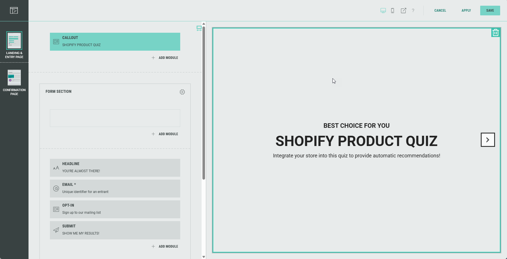
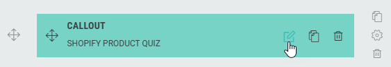
You can edit the Callout module in the Page Builder by clicking it, or by clicking on the Pencil icon.
The following can be edited (available from the tabs at the top): Content, Design, and Logic.
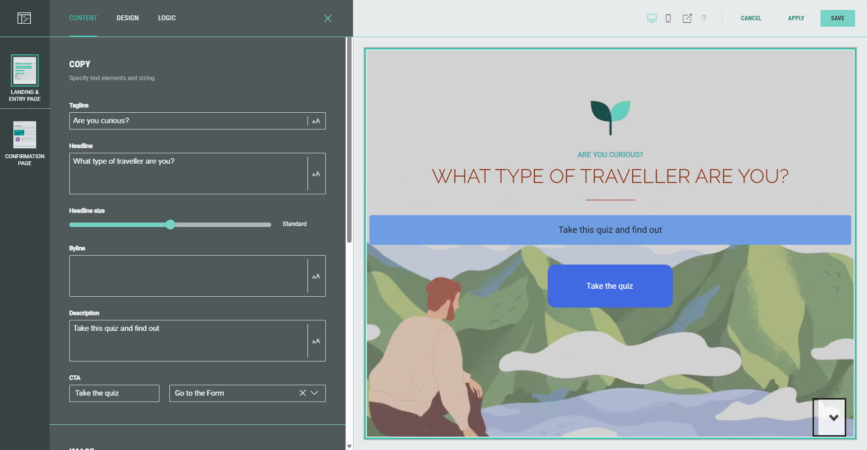
Content
Copy
In the Copy section, you specify text elements and sizing.
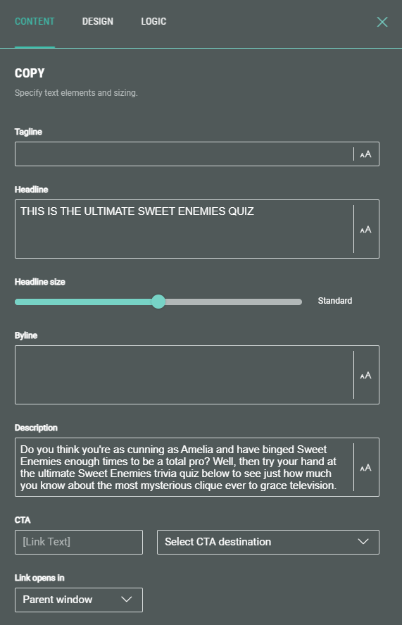
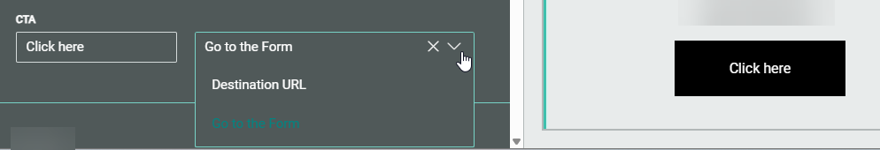
Specify elements such as the headline, byline, description, and a Call-To-Action (CTA) button.
The CTA button can direct entrants to a different section of the Experience or to an external URL. The text copy on the CTA button can be edited as you wish.
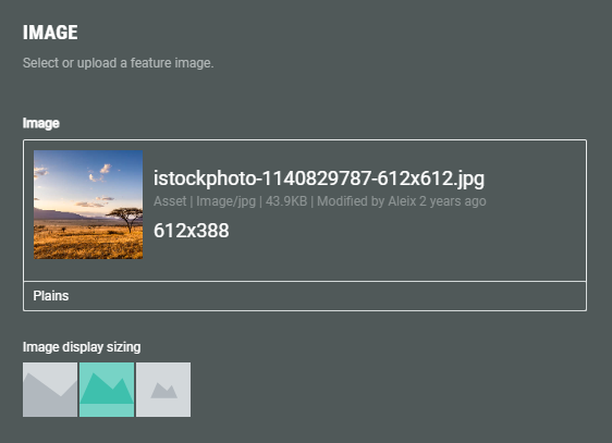
Image
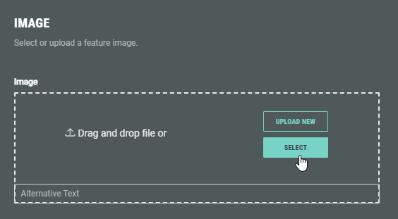
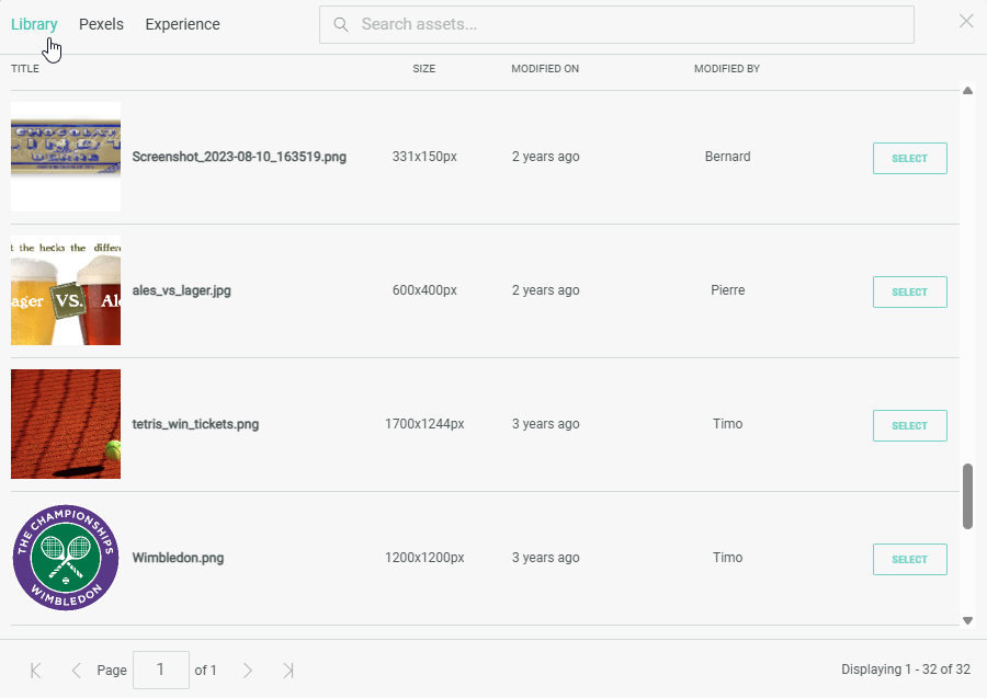
You can add an image to the content by uploading an image from your computer, or selecting from pre-uploaded assets from the Grow library or the Experience, or from the Pexels library.
You can choose the image display sizing: Cover (fill space while maintaining aspect ratio), contain (scale image to maintain aspect ratio while fitting within the given space) or native (use actual image size).
Icon image
You can select or upload an icon image or a logo. The minimum recommended resolution is 100x100px. The image will display in the original image size.
Design
On the Design tab, you can define the layout, background, text alignment, and advanced options.
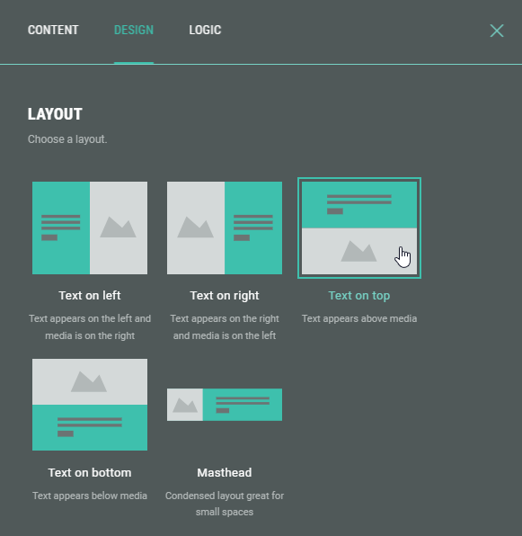
Layout
You can arrange the module in a variety of ways. Select one of the available layouts.
Background
Use this to override the background for this module.
Example: of a background color and image being set.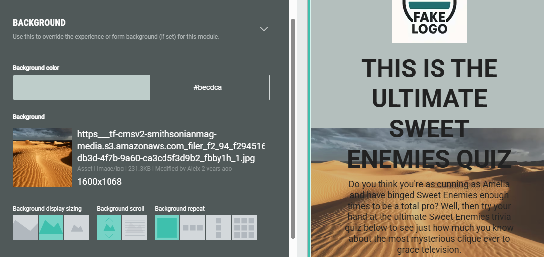
Note: More info on how to add a background to an Experience can be found in this article.
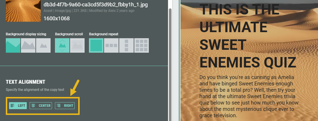
Text alignment
Specify the alignment of the text copy: Left, center or right aligned.
Advanced options
With the advanced options, you can configure the display height of the module and set a custom class name (to use custom CSS).
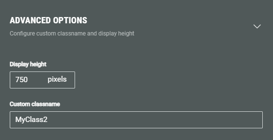
- Display height — Defines the fixed pixel height for this module.
Note: This overrides any heights set in the theme or stylesheet.
Warning: Only touch this section if you are a developer, as this may impact your Experience hugely.
- Custom classname — Will be output as xCustomModule-[Your-CSS-Classname] in the module when it is rendered on the page. Use this to give your module a unique style. You can also target CSS classes in a theme using the custom CSS classname.
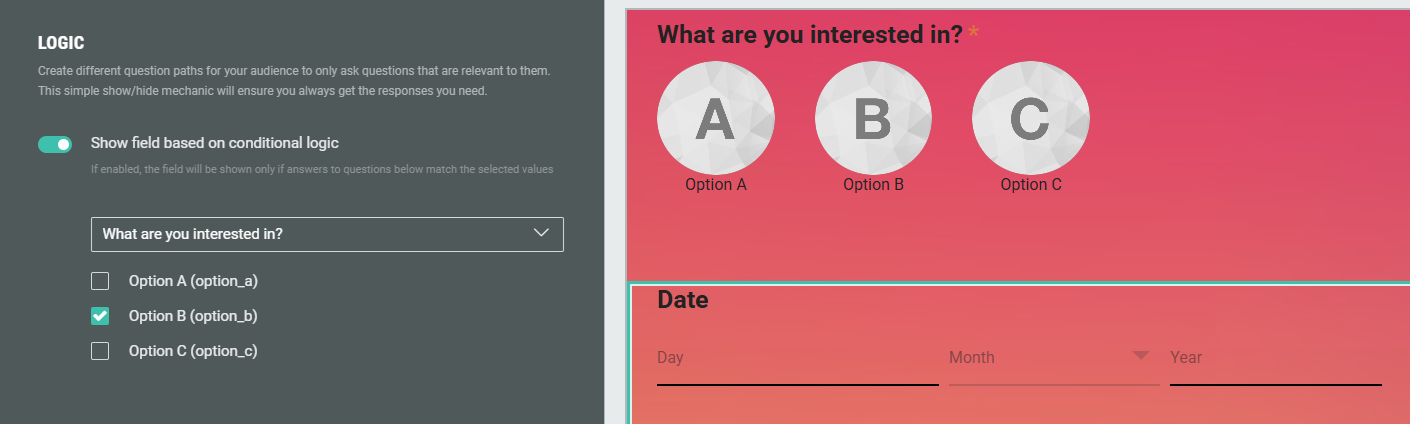
Logic
On the Logic tab, you can create different question paths for your audience to only ask questions that are relevant to them. This is based on conditional logic determined by answers given to quiz questions in this Experience.
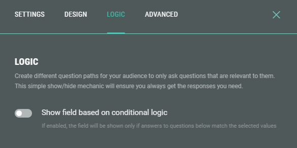
Example: Only show the field when Option B was given as answer to a What are you interested in? question earlier on in the Experience.